

The General Theory ch.18
Pictures!!!

In chapter 18, Keynes is officially over the hump in the book: every part of the model has been laid out, and the rest of the book is dedicated to reflection on the model. The really philosophical stuff doesn’t start until the last couple of chapters. The ones before that address some potential criticisms of the model put forward. Today though, we’re looking at Keynes’ birds-eye-view reconstruction of the book’s model, now that the reader presumably has all of the parts in hand. Since I already did a recap post once here, I’m going to use this opportunity to do one of my favorite things in all of the economics literature: make a wildly confusing causal diagram that expresses what goes where in the model.
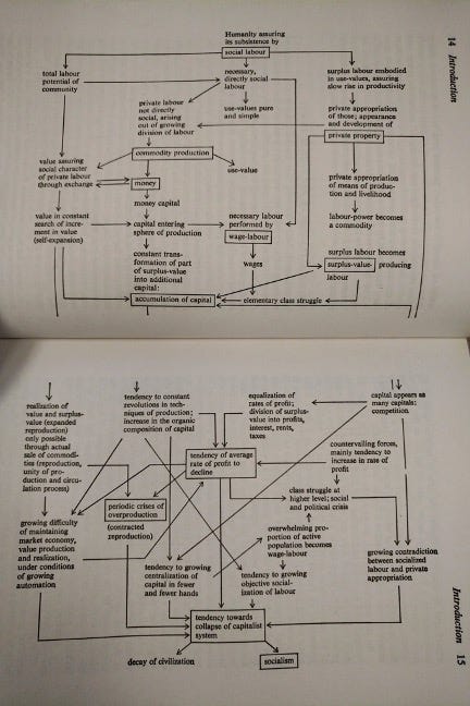
These have a long history, and I love each and every one of them. Since Marx’s Capital came out, people have been trying to draw all the tensions in the book out in graphical form.
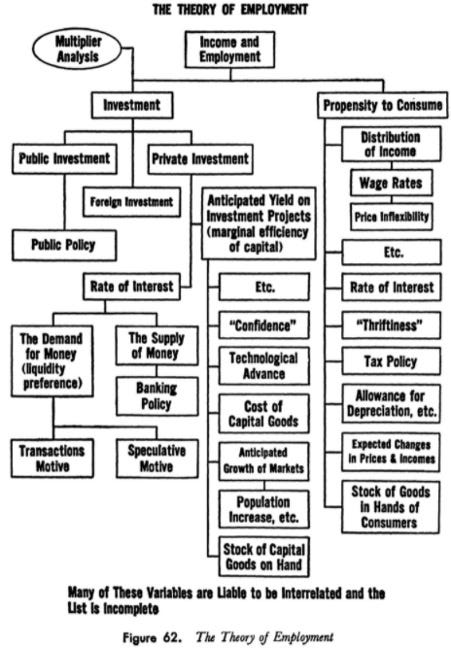
Even Lorie Tarshis, who not-so-famously wrote the first Macroeconomics textbook based on the General Theory, tried his hand at charting it out.
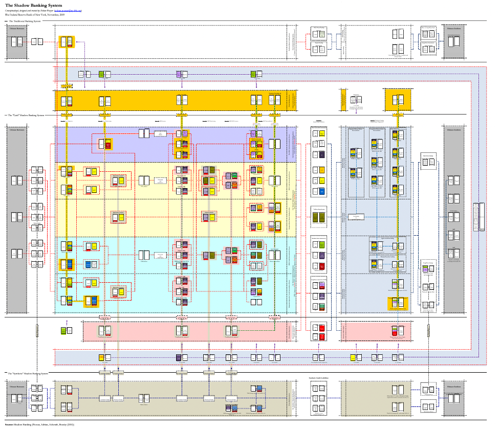
I think the result here is a little sad. Sure, all these things are linked, but where are the arrows! Maybe a closer jumping off point for these particular charts – especially in their formatting – is Zoltan Pozsar’s famous map of the shadow banking system. I used to have a 3’x4’ poster of this hanging up in my living room back when I lived in the Mansion on the Hudson, and I think it is the most fun and most confusing flow chart of all time. Today’s post is my loving homage.
Anyway, we’ve talked a lot in this series of essays about the methodology of modelbuilding, the importance of understanding underlying causal claims, and the sheer complicatedness of Keynes’ model. Hopefully being able to look at a bunch of terms pointing at one another will make it a little easier to understand what’s going on in the book, and in the model itself. I personally think that – however goofy they look – big confusing flow charts actually make things much clearer. The tricky part is figuring out what the authors intend all the different words on them to mean.
This is going to be a short post, because it took a while to make these extremely goofy charts. I’m just going to leave them here, and explain them step by step, and point out some interesting causal loops. If people find them entertaining enough, probably I’ll do a run of posters or tshirts or something. I think it’s cute. Without further ado, The Model:
Keep reading with a 7-day free trial
Subscribe to Continuous Variation to keep reading this post and get 7 days of free access to the full post archives.